도전과제- position과 flexbox를 연습해보자 - 개인 해답 (feat:코딩알려주는 누나/ HTML CSS)
최대한 저의 힘과 방식으로 풀어보고, 잘안되는 것은 풀이를 보고 만들어봤습니다.
다음 클론 코딩 시작하기 전 몸풀기 과제입니다.
ps:
참고하시길 바랍니다.
0.현해 스크린샷에서 빨간 테두리 라인은 각 박스가 어느 영역에 속해있는지를 쉽게 보기 위하여, border를 활용하였습니다.
1.부모태그에서 display:flex를 통해 현재 태그가 부모태그임을 명시해주고, justify-content:......등을 통해 자식태그를 조종한다라고 이해해주셔도 좋습니다.
2.position은 조종하려는 태그에서 속성값을 입력해 조종한다. 단 부모태그가 static이냐 relative 속성이냐에 따라 결과가 틀려지고 관련 문제는 3번입니다.
1번문제
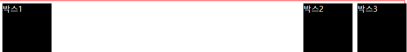
html
<!DOCTYPE html>
<html>

<head>
  <meta charset="utf-8">
  <meta name="viewport" content="width=device-width">
  <title>replit</title>
  <link href="style.css" rel="stylesheet" type="text/css" />
</head>

<body>
  <div class="background">
    <div class="box">박스1</div>

    <div class="locate">
      <div class="box">박스2</div>
      <div class="box">박스3</div>
    </div>


  </div>


</body>

</html>
css
html {
  height: 100%;
  width: 100%;
}

.background {
  border: 1px solid red;
  height: 100vh;

  display: flex;
}


.box {
  background-color: black;
  width: 100px;
  height: 100px;
  color: white;
  margin: 5px;
}

.locate {
  display: flex;
  position: absolute;
  right: 0%;

}
2번문제
2번 문제는 하다가 풀이를 봤는데, 많이 간단하더라고요 처음에 구상한 것에서 한발자국 더 나가면 되었는데, 새로운 것을 아쉽게도 활용을 못해서 결국 답지를 봤습니다.
대신 flex가 대략적으로 어떻게 작용하는지와 새로운 것을 알 수 있었고 그것을 다소 복잡하지만 저만의 방식으로 풀이해봤습니다.
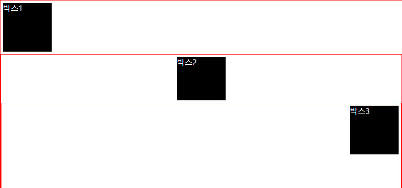
html
순차적으로 영역을 나누는 것을 해보고싶어 구현했습니다.
<!DOCTYPE html>
<html>

<head>
  <meta charset="utf-8">
  <meta name="viewport" content="width=device-width">
  <title>replit</title>
  <link href="style.css" rel="stylesheet" type="text/css" />
</head>

<body>
  <div class="background">
    <div class="box">박스1</div>
    <div class="background flex-setting">
      <div class="box locate1">박스2</div>
      <div class="background flex-setting ">
        <div class="box locate2">박스3</div>
      </div>
    </div>
  </div>


</body>

</html>
css
각 설정을 세부적으로 조절하고 싶어 여러개의 속성을 만들어봤습니다.
html {
  height: 100%;
  width: 100%;
}

.background {
  border: 1px solid red;
  height: 100vh;
}


.box {
  background-color: black;
  width: 100px;
  height: 100px;
  color: white;
  margin: 5px;
}


.flex-setting {
  display: flex;
  flex-direction: column;
}

.locate1 {
  align-self: center;
}

.locate2 {
  align-self: flex-end;
}
3번문제
이 문제는 무엇인가 어설프게 되서 왜 그런가 했더니 다음과 같은 이유가 있어 되지가 않았더라고요...
어쨌든 좋은 거 하나 알게되었습니다 ㅎㅎ
- position:static 이 상태에서 absolute를 주면 화면 전체 기준입니다. 이때 box1의 position의 값을 relative를 주게되면 자식인 box2는 부모상자 box1을 기준으로 absloute를 위치 시킨다고 합니다.- 코딩알려주는누나 풀이 인용.
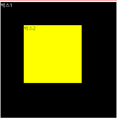
html
<!DOCTYPE html>
<html>

<head>
  <meta charset="utf-8">
  <meta name="viewport" content="width=device-width">
  <title>replit</title>
  <link href="style.css" rel="stylesheet" type="text/css" />
</head>

<body>
  <div class="background">
    <div class="box1 locate">박스1
      <div class="box2 locate1 ">박스2
      </div>
    </div>

  </div>


</body>

</html>
css
html {
  height: 100%;
  width: 100%;
}

.background {
  border: 1px solid red;
  height: 100vh;
}


.box1 {
  background-color: black;
  width: 400px;
  height: 400px;
  color: white;
  margin: 5px;
}

.box2 {
  background-color: yellow;
  width: 200px;
  height: 200px;
  color: green;
  margin: 5px;
}


.locate {
  position: relative;

}

.locate1 {
  position: absolute;
  left: 75px;
  top: 75px;


}
4번문제
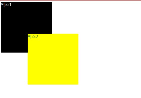
html
<!DOCTYPE html>
<html>

<head>
  <meta charset="utf-8">
  <meta name="viewport" content="width=device-width">
  <title>replit</title>
  <link href="style.css" rel="stylesheet" type="text/css" />
</head>

<body>
  <div class="background">
    <div class="box1 ">박스1
      <div class="box2 locate1 ">박스2
      </div>
    </div>

  </div>


</body>

</html>
css
html {
  height: 100%;
  width: 100%;
}

.background {
  border: 1px solid red;
  height: 100vh;
}


.box1 {
  background-color: black;
  width: 200px;
  height: 200px;
  color: white;
  margin: 5px;
}

.box2 {
  background-color: yellow;
  width: 200px;
  height: 200px;
  color: green;
  margin: 5px;
}


.locate1 {
  position: relative;
  left: 100px;
  top: 100px;


}
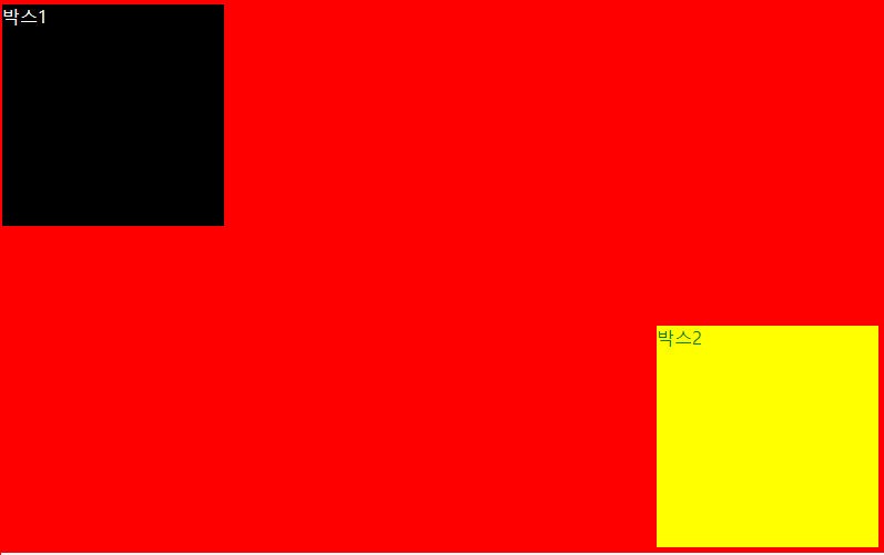
5번문제
5번문제는 치수나 내부 박스의 위치를 개인적으로 살짝 변형하였습니다.
그렇지만 방식에 있어서 큰 차이가 없습니다.
html
<!DOCTYPE html>
<html>

<head>
  <meta charset="utf-8">
  <meta name="viewport" content="width=device-width">
  <title>replit</title>
  <link href="style.css" rel="stylesheet" type="text/css" />
</head>

<body>
  <div class="background">
    <div class="box">
      <div class="box1 locate1">박스1
      </div>
      <div class="box2 locate2">박스2
      </div>
    </div>


  </div>


</body>

</html>
css
html {
  height: 100%;
  width: 100%;
}

.background {
  border: 1px solid red;
  height: 100vh;
}


.box {
  background-color: red;
  width: 800px;
  height: 500px;
  color: blue;
  margin: 5px;
  position: absolute;
  left: 0px;
  top: 0px;
}

.box1 {
  background-color: black;
  width: 200px;
  height: 200px;
  color: white;
  margin: 5px;
}

.box2 {
  background-color: yellow;
  width: 200px;
  height: 200px;
  color: green;
  margin: 5px;
}


.locate1 {
  position: absloute;
  left: 0px;
  top: 0px;
}

.locate2 {
  position: absolute;
  right: 0px;
  bottom: 0px;
}